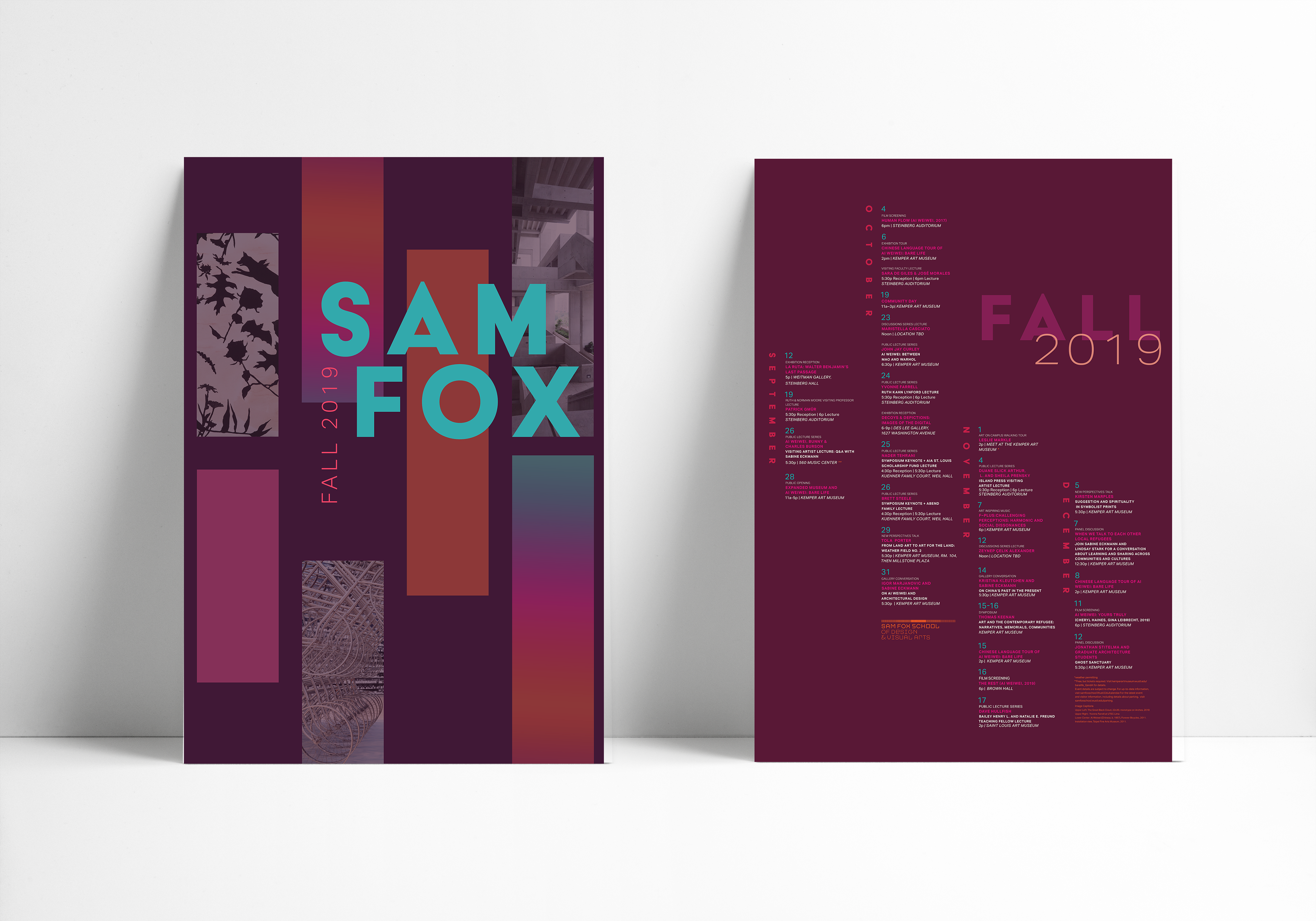
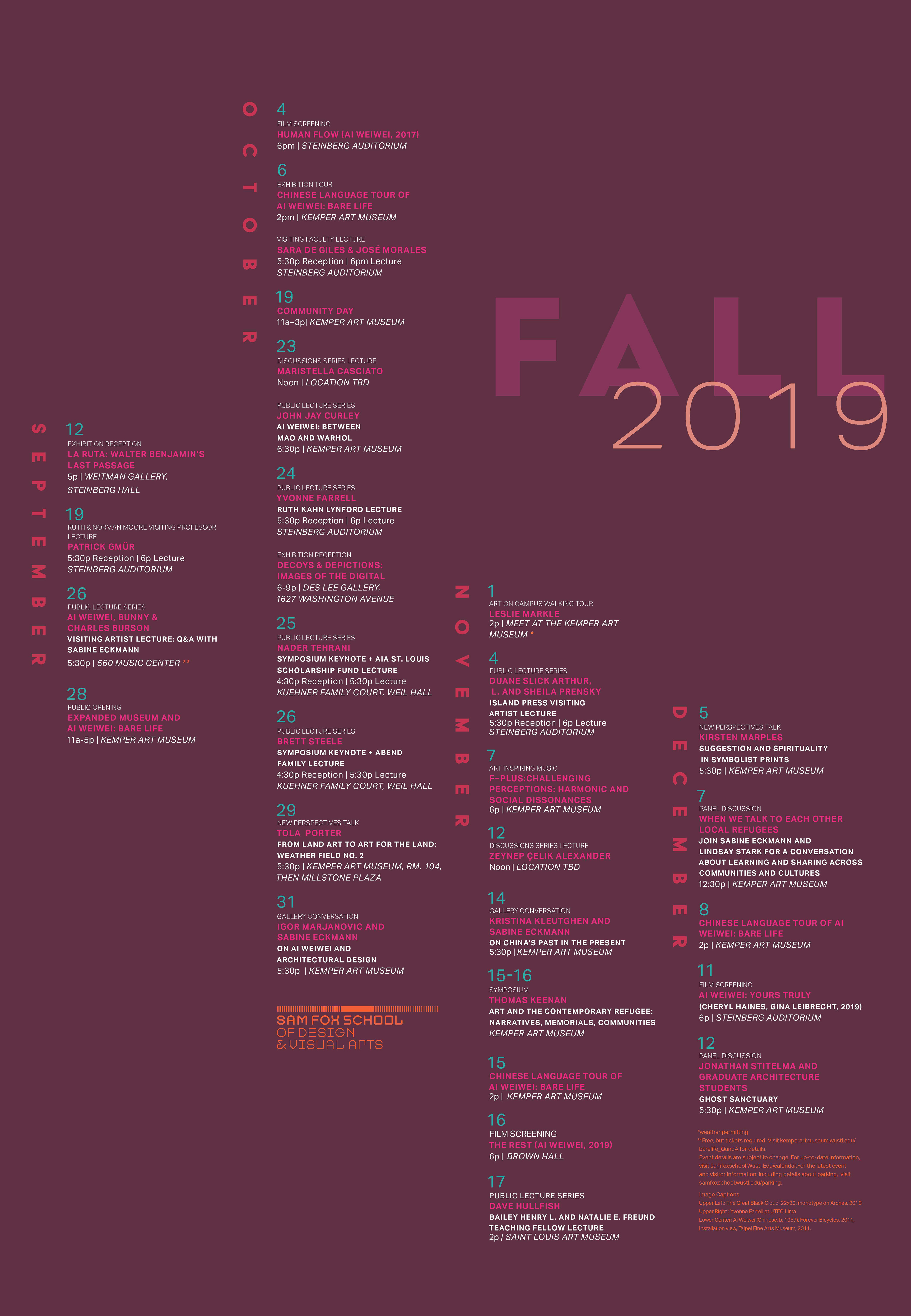
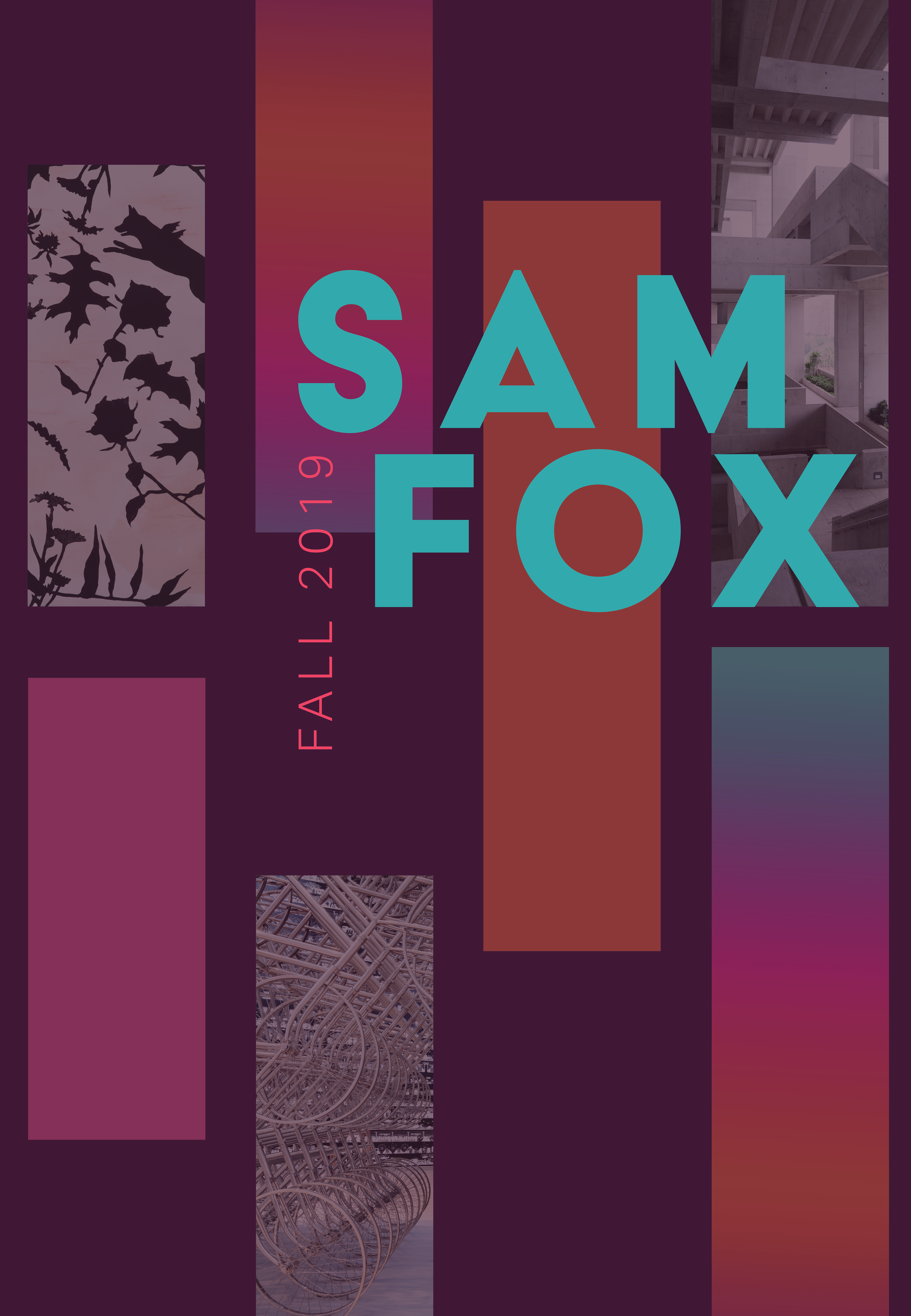
This project resulted in a redesign of the school’s promotional calendar. When designing this work I focused on evoking a sense of movement and I wanted to use a unique color palette. I wanted something different and unique so I chose to have a palette of purple, pink, blue and orange. With this project we were restricted in the images and text we could use. The poster had to have a front and a back side so I made it that both sides of the poster had the same grid and mimicked each other but were still different.